Why Pattern Mixing Has Rules at All
Pattern mixing looks effortless on the people who do it well — and completely accidental on the people who don't. The difference usually isn't talent or intuition. It's a handful of principles borrowed from visual design that most experienced dressers absorb without ever naming them.
Understanding those principles matters because fashion rules are rarely arbitrary. As we explore in The Style Myths Most People Still Believe, many so-called rules are outdated restrictions worth ignoring — but the mechanics of visual harmony are different. They reflect how the human eye processes competing information. When two patterns fight for attention at the same scale, the eye can't settle and the result reads as noise. When patterns are deliberately varied, the eye moves fluidly and the outfit feels composed.
The goal isn't to follow rules for their own sake. It's to understand why certain combinations land so you can experiment with actual confidence.
Start Simple, Build Confidence
If pattern mixing feels daunting, begin with a low-stakes combination: a subtle stripe paired with a small floral in the same color family. This narrow-scale entry point builds pattern-mixing intuition before you attempt bolder combinations. Most successful mixed-pattern outfits follow the exact same logic, just applied more ambitiously.
The Core Principles Before You Start
Before pulling pieces from your closet, it helps to have a mental checklist of the variables in play. Pattern mixing is really a color and proportion problem — and both have clear frameworks.
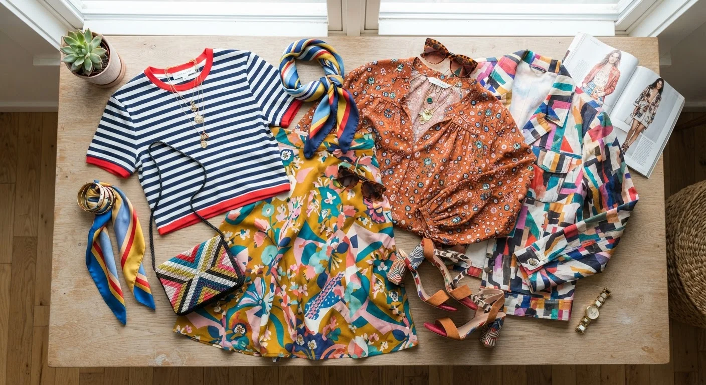
Color is your connector. When two patterns share at least one color, they already have a reason to coexist. A navy-and-white stripe paired with a floral that carries navy in its petals creates a visual thread that reads as intentional. If you want a deeper foundation for this, Color Theory for Everyday Dressing explains exactly how colors relate and why certain pairings feel natural.
Scale is your structure. The most reliable pattern-mixing technique is combining a large-scale print with a small-scale one. Think wide-set plaid with a micro dot, or an oversized botanical with a fine pinstripe. The contrast in size prevents either pattern from overpowering the other.
Visual weight matters too. A busy, high-contrast pattern carries more visual weight than a tonal, low-contrast one. Pairing two high-contrast patterns of similar scale is the fastest route to a look that feels unintentional. Balance a bold print with something quieter — a subdued check, a muted houndstooth, a barely-there texture.
Neutrals play a supporting role throughout. Neutral Colors in Fashion breaks down how these quieter tones can anchor even a heavily patterned outfit without shutting it down.
How to Build a Mixed-Pattern Outfit Step by Step
Choose your anchor pattern
Start with the most prominent pattern in your outfit — the one you're most excited about wearing. This is your anchor. It sets the color palette and the general energy of the look. Everything else will respond to it rather than compete with it.
Identify its color palette
Look closely at your anchor pattern and note every color present — including background colors and minor accent shades. This palette is your toolkit. Your second pattern should contain at least one of these colors, creating a visual bridge between the two pieces.
Select a supporting pattern at a different scale
Choose a second pattern that differs clearly in scale from your anchor. If your anchor is a large floral, reach for a fine stripe, a micro check, or a small geometric. The size difference is what allows both patterns to coexist without visual conflict. Confirm it shares at least one color with your anchor.
Check the overall visual weight
Step back and assess both patterns together. Is one so loud that the other disappears entirely? Is neither pattern willing to recede? Ideally, your anchor pattern draws the eye first, and the supporting pattern adds interest on closer inspection. Adjust contrast or scale if the balance feels off.
Add a solid or neutral to ground the look
Introduce at least one solid element — a belt, a solid-colored shoe, a plain layer — that picks up a color from your patterns. This gives the eye a place to rest and reinforces the color connection you've established. It also makes the overall outfit feel more deliberate rather than accidental.
Once you've practiced this framework a few times, it becomes instinctive. And remember — accessories count too. A patterned scarf, printed bag, or graphic sock can function as a third pattern layer if everything else observes the scale and color rules. See how accessories shift a finished look in The Role of Accessories in a Complete Outfit.
Common Stumbling Blocks and How to Avoid Them
Even with the right principles in hand, a few pitfalls trip people up repeatedly.
- Same scale, same contrast: Two bold geometric prints at identical scales compete directly. If you love both pieces, introduce a solid between them or swap one for a lower-contrast version of the same pattern type.
- No color link: Patterns that share zero colors require a much stronger commitment to scale and texture contrast to hold together. It can work, but it's a harder equation to balance for beginners.
- Forgetting the full outfit: A patterned top and patterned pants might look great in isolation but clash in combination. Check the complete silhouette before leaving the house — what reads as interesting in a drawer can read as overwhelming on the body.
- Treating stripes as neutral: Stripes are a pattern. A fine pencil stripe behaves more like a neutral; a wide colorblock stripe does not. Know which kind you're working with before mixing it in.
Pattern mixing is one of the more expressive ways to develop a personal style, and it pairs naturally with a thoughtful, considered wardrobe. For perspective on building that kind of foundation, Timeless vs. Trendy is a useful companion read.
Mirror Check Before You Commit
Pattern combinations that look cohesive on a hanger or flat surface can read differently on the body, where fabric folds, drape, and proportion shift the visual balance. Always do a full-length mirror check before finalizing a mixed-pattern outfit. Natural or bright indoor light will show you the most accurate version of how the patterns interact.