True Neutrals vs. Near-Neutrals: The Real Distinction
Understanding neutrals starts with a simple split. True neutrals — black, white, and gray — contain no dominant color wavelength. On a color wheel, they don't exist because they have no hue at all. That's what makes them universally mixable: they don't clash because there's nothing to clash with.
Near-neutrals are a broader, more practical category. Colors like camel, ivory, warm beige, taupe, navy, olive, and blush all carry a faint underlying hue, but they're muted enough in saturation that they behave like neutrals in everyday dressing. They won't overwhelm other colors, and they form the backbone of most real-world capsule wardrobes.
If you want to dig deeper into how hue and saturation shape color relationships, our color theory primer covers the fundamentals in practical, outfit-focused terms.
Neutrals Aren't One-Size-Fits-All
The category of 'neutral' is somewhat context-dependent. In a very saturated, color-forward wardrobe, even a muted olive or slate blue can function as a neutral. The defining characteristic isn't a fixed list of shades — it's low saturation and visual recession relative to the other colors in an outfit. Think of neutral as a role a color plays, not just a fixed list of shades.
Undertones: The Hidden Factor in Neutral Pairing
Even within neutral territory, undertones create real differences. A cream top can skew yellow-warm or blue-cool depending on the fabric dye. A gray coat can read as warm greige or cool slate. When you combine neutrals without thinking about undertones, the outfit can feel slightly off without you knowing why.
The general principle: mix warm neutrals with warm neutrals, and cool neutrals with cool neutrals. An ivory blouse and camel trousers share warm undertones and look natural together. Pairing that same ivory with an ash-gray jacket introduces a mild tension that some find interesting, while others find it unsettling.
This undertone thinking also carries into beauty choices. If you've ever struggled to match a foundation or concealer to your skin, understanding your skin's undertone follows exactly the same logic applied to color.
Test Neutrals Side by Side Before Buying
If you're shopping for a neutral to complement something you already own, bring that existing piece with you — or check fabric swatches in natural light. Two items labeled 'beige' can differ significantly in undertone under store lighting, making them look mismatched once you're outside. Natural daylight is the most reliable environment for comparing neutral shades.
How to Build Outfits Around Neutrals
Neutrals earn their wardrobe reputation because they work across three distinct outfit roles:
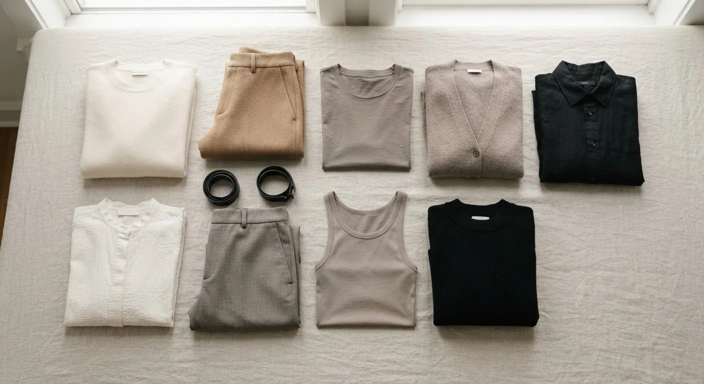
- As a full look: An all-neutral outfit relies on tonal variation and texture contrast to stay visually alive. A chunky oatmeal knit, slim camel trousers, and tan leather mules operate in the same color family but read distinctly because of material differences.
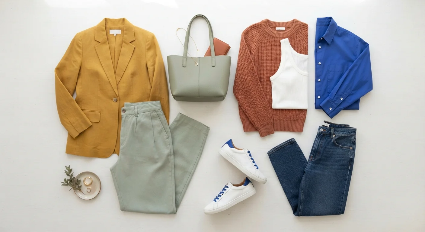
- As a base for color accents: Neutral pieces act as a canvas. A charcoal suit or bone-colored dress lets a single statement color — a cobalt bag, a burgundy shoe, a printed scarf — read clearly without competition.
- As connective tissue in pattern mixing: Neutrals help anchor mixed prints by giving the eye a resting place. Pattern mixing relies on this kind of color linking to keep bold combinations from tipping into chaos.
Neutrals also age well as wardrobe investments. Because they don't depend on seasonal color trends, they sit at the intersection of what's always relevant — a quality explored more in our breakdown of timeless versus trendy pieces.
~70%
of capsule wardrobe recommendations include neutral-dominant pieces
Wardrobe-building frameworks from fashion editors and stylists consistently center neutrals as the foundational majority of a functional, versatile closet.
5–6
Core neutral shades in a typical wardrobe palette
Most styling guides suggest a working palette of five to six neutral shades — typically black, white, gray, navy, and one or two warm tones like camel or taupe — as a practical foundation.
Making Neutrals Feel Fresh, Not Flat
The most common critique of neutral dressing is that it looks safe to the point of dull. Texture is the most reliable fix. When multiple fabric types share a color family, the variation in how light hits each surface does the visual work that color would otherwise do. Consider how differently matte wool, glossy satin, and nubby linen read even in identical shades of cream.
Proportions matter just as much. A wide-leg trouser and an oversized blazer in matching stone tones create shape and structure without relying on color contrast. Meanwhile, a fitted black turtleneck under a loose charcoal coat uses tonal layering and silhouette to create depth.
It's also worth noting that fabric quality tends to show more prominently in neutral clothing because there's no bold color to draw the eye away from how a garment drapes or wears over time. Understanding how fabrics behave becomes especially useful when building a neutral wardrobe meant to last.