The Color Wheel: Your Outfit's Invisible Map
At the center of color theory is the color wheel — a circular arrangement of hues that shows how colors relate to one another. Primary colors (red, yellow, blue) sit evenly spaced around the wheel. Mixing two primaries produces secondary colors (orange, green, violet), and mixing a primary with a neighboring secondary creates the tertiary hues in between.
Why does this matter for getting dressed? Because the wheel makes relationships visible. Instead of instinctively avoiding certain combinations, you can see at a glance which pairings are inherently harmonious and which ones are meant to create contrast. It's less about rules you must follow and more about understanding why some combinations feel satisfying and others feel off.
If you're also building out your wardrobe strategically, the color wheel pairs naturally with the process of building a wardrobe from scratch — helping ensure the pieces you invest in can actually work together.
90%
Snap judgments based on color alone
Research in environmental psychology suggests that up to 90% of an initial impression of a product or person can be based on color, according to a study published in the journal Management Decision.
3
Core color relationships used in most outfits
Fashion educators generally reduce practical color dressing to three relationships — complementary, analogous, and neutral anchoring — which cover the vast majority of everyday outfit combinations.
Three Core Color Relationships Explained
Complementary: Bold and High-Contrast
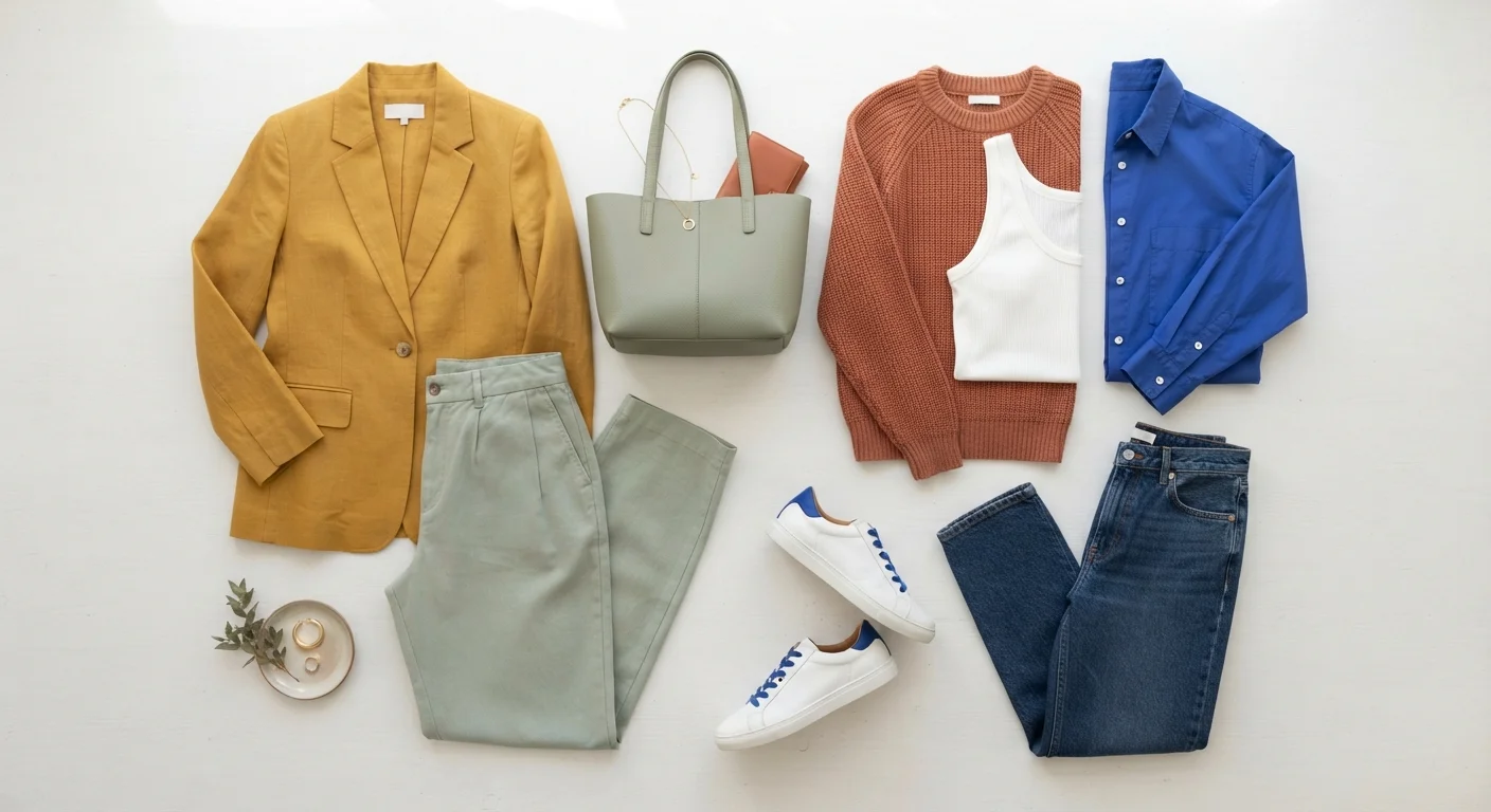
Complementary colors sit directly opposite each other on the wheel. Blue and orange, red and green, purple and yellow — these pairings produce the most visual energy. In fashion, they read as confident and intentional. The trick is often to mute one of the two: pair a bright cobalt blue with a warm camel rather than a fully saturated orange, and the effect is striking without being overwhelming.
Analogous: Effortlessly Cohesive
Analogous colors are neighbors on the wheel — think blush, dusty rose, and burgundy, or sage, olive, and forest green. These combinations feel naturally harmonious because the hues share underlying pigments. They're low-effort in the best way: an analogous outfit looks considered without requiring much deliberate planning. Varying texture and proportion keeps the look from appearing too uniform.
Triadic and Neutral Anchoring
Triadic combinations use three colors evenly spaced around the wheel. They're more complex to pull off, but anchoring the trio with one dominant neutral makes it manageable. More practically for everyday dressing: neutrals — white, black, beige, grey, navy — aren't technically on the color wheel, but they act as essential buffers that let almost any color pairing breathe.
Tone, Saturation, and Why They Matter More Than Hue Alone
Two shirts can both be called "green" and look completely different depending on their tone (how light or dark) and saturation (how vivid or muted). A sage green and a neon lime are technically the same hue, but they behave very differently in an outfit.
This is where many people get tripped up. A color combination that looks jarring at full saturation can feel sophisticated when one or both colors are muted or desaturated. Earth tones — terracotta, warm ochre, dusty teal — work so well together partly because their reduced saturation makes them inherently easy to combine.
Match Saturation Levels for Easy Combinations
When in doubt about whether two colors will work together, check whether they share a similar intensity. Muted tones tend to pair well with other muted tones, while vivid colors read best alongside other vivid hues. Mixing a washed-out shade with a bright one often creates the unintentional contrast that makes an outfit feel "off."
When combining colors, try to match their energy level: pair two muted tones, or two vivid ones, rather than mixing a washed-out neutral with an electric primary. Consistency in saturation tends to produce the most cohesive results. This principle also applies directly when you're mixing patterns, where color linking across prints is a key technique.
Putting It Into Practice
You don't need to consult a color wheel every morning. Once you've absorbed a couple of core relationships, they become second nature. A useful starting exercise: look at an outfit you already feel good in and identify what color relationship it uses. Chances are it's one of the three covered above — you've probably been using color theory intuitively without realizing it.
From there, try one intentional experiment: swap a neutral piece for a complementary hue, or build a full look within one analogous family. The goal isn't to follow rules perfectly but to develop a more conscious eye for what you're already drawn to.
Color is just one layer of a complete personal style. For a broader view of how all the fundamentals fit together — including silhouette, proportion, and personal preference — developing your personal style from the ground up is a natural next step. And if you're navigating specific occasions, understanding dress codes can help you apply these color principles in context.
Color Theory Is a Guide, Not a Rulebook
These principles describe tendencies, not absolutes. Fashion regularly celebrates combinations that "shouldn't" work by color theory standards — and they do work, because of context, cut, texture, or sheer intention. Think of the wheel as a starting point for experimentation, not a strict prescription. The more you observe and try, the more your eye will naturally calibrate to what feels right for you.